How to Optimize Your Landing Page

A landing page is a standalone web page that visitors “land” on after clicking a paid google search result, social media or banner display ad. Sometimes called “prison pages” these pages focus on a single call to action (CTA) and don’t have traditional page navigation or outgoing links. A well-designed landing page is a powerful digital marketing tool, but to maximize your conversion rates there are some important points to keep in mind.

Think of the User When Building a Landing Page
When designing a landing page you always want to start by putting yourself in the shoes of your user.
Who are they? Even the most beautifully designed page won’t convert if you don’t talk to the right audience. Take the steps to identify 2-3 “typical” members of your target audience and use those personas to guide your decisions for page content.
What are their pain points? Identify what problems you can solve for your audience and focus on how your product or service can solve them.
Where are they in their journey? Tailor your content to where your user might be in their buying journey. Someone starting to research their options will be looking for different information than someone ready to make a purchase.
How can you help them? Ultimately, customers want to know how you can help them. Don’t overload them with information about how great you are, but instead let them know how you can make their life better. Use “you” more than “we”.

Foster Trust on Your Landing Pages
First and foremost, users need to know that they can trust you and your page.
Make sure your message matches the ad. To minimize bounce rates, and increase quality scores, make sure that your landing page pays off on the offer/promise/claim made in whatever ad brought them to it. If you use more than one offer, have multiple pages to match. Upon clicking an ad, your user should immediately feel confirmed that they are in the right place and will find the answers they were promised.
You’re the expert. Once your user is confident they are in the right place, you’ll need to prove your expertise. In addition to writing meaningful copy, showcase accreditations, certifications, and/or media endorsements. Provide social proof by including useful reviews and testimonials (ideally with a profile photo) from your customers.
Consistency is key. Lastly, make sure your page design is not only consistent with the content and look of the source ad, but also with your main site and other marketing materials. Consistency encourages brand recognition, adds a level of professionalism, and builds trust with your audience.
Keep Your Landing Page Simple
A landing page is not a mini website—it’s a targeted message to a targeted group. It needs to capture your audience’s attention and entice them to learn more, without overwhelming them with every detail. Every choice for your landing page content should be intentional and add value—this isn’t the time to add extra fluff.
Have a Singular CTA. Eliminate all navigation and external links. Your page has a singular purpose. Whether that purpose is to get your user to “Learn More”, “Buy Now”, or “Download”, every bit of content should speak to that purpose. Don’t exhaust users with too many options. Instead, lead them where you want them to go and use your page elements to reinforce that singular goal.
Compelling Imagery: Utilize high quality, professional imagery that relates to your audience. Stock images are fine as long as they are carefully chosen to align with your user personas and have a consistent style. Avoid sliders and distracting video backgrounds. Careful use of animation can help grab attention but use sparingly so as not to distract from the primary goal of the page. Product videos or video testimonials can be powerful but keep them short.
Concise Copy: Copy should be tailored to your audience, clear, and scannable. Use short, digestible chunks of copy, punctuated by clear subheads that make it easy for the user to scan for the information that matters most to them.
Anticipate questions. Again (always!) think of your user and what kinds of barriers they may have prior to converting. Answer those objections in your page copy.

Include Components of Smart Landing Page Design
Have a hierarchy of elements. Use size, typeface selections, grouping and white space to guide your user through the most important elements of the page.
White space is important! Having space around an element helps to call attention to it. White space also gives the viewer a place to visually rest and helps keep the overall page from feeling cluttered and overwhelming.
Keep forms as short as possible. Don’t ask for more information than what is essential to achieve your goal. Keep your user in mind—people will be less likely to fill out more fields the earlier they are in their decision-making process. If a longer form is necessary, consider breaking it into 2-3 shorter steps, but be sure to indicate that to the user by including “step 1 of 2” or some other progress indicator.
Contrasting color for CTA button. Be sure to use brand colors on your page but select a contrasting color for your CTA and use sparingly for information you want to call particular attention to.
Use icons to break up text. Icons help to visually communicate a concept, which can help to reinforce ideas outlined in your copy and also serve as a way to break up sections of longer text, helping to make the page feel more inviting and (when paired with white space) less cluttered.
Optimize for mobile. It depends on your audience, but often mobile is the primary experience for b2c interactions. Make sure your pages are optimized for easy viewing on a mobile device. Clarity, simplicity, and ample space between elements is even more important on mobile. Keep image file sizes small and be sure to include useful alt tags for accessibility.
Have CTA above the fold. It can be tricky to manage the small amount of real estate above the fold, but testing shows that conversion rates are better when your form is higher on the page. Keeping the form above the fold also ensures that the majority of visitors will see your call to action.
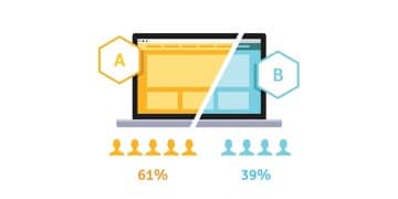
Test, test, test.
These design tips can help to improve conversions, but the only way to be sure you’re getting the best conversion rates possible is to run AB tests. Common tests can include hero image options, headlines, button color, form length, and page length. If a page is performing poorly, it’s best to do a multivariate test—meaning test multiple changes at once for a greater chance at seeing a positive impact. If your page is already doing well, it’s best to make small changes, one at a time, so that you can get a better idea of which changes most affect performance for your particular audience.
Summary:
There is no one-size-fits-all in landing page design, but there are certain key considerations that are common among successful pages.
- Know your user and keep them in mind throughout the process
- Foster trust
- Keep a simple, singular focus
- Include components of smart design
- Test, test, and test some more