How to Improve User Experience for More Conversions

Reducing User Friction through UI/UX Improvement on Form Flows and Shopping Result
Optimization is a keyword very much used in the digital space. Everything is measurable on the internet, which facilitates the creation of enhancement processes to improve user experience, yield, revenue, margins, and quality. All these points will directly influence the business’s bottom line.
If you want to increase that bottom line, build an optimization pipeline, prioritize actions, and always strive to incrementally improve conversions and engagement.
How to Build a Pipeline of Optimizations
Identify Potential Issues
Before building your optimization strategy, you’ll need to follow three critical steps to identify the problems you are trying to solve. It seems an obvious statement, but it’s not a simple exercise. That’s why breaking down your issues into different boxes can help you build a systematic problem-solving approach in your organization.
- Identify your business digital goals and barriers. Start by defining a significant goal, such as increase form completion rate and then dissect it by adding the obstacles, such as: (1) my form is too long with many steps (generates too much friction), (2) the engagement with my landing page varies in function of the traffic source, (3) the step-by-step drop-off rate is too high on pages/questions that request personal information (user trust issue). Once this is done, you’ll have sub-problems that are easier to address and tackle
- Mine your data to help you detect issues that haven’t been recognized yet. An analytical approach can support your problem definition process by pointing quantitively where engagement is weak and where you are losing your users. The data will also help you prioritize issues that must be solved first given the high impact on your results.
- Map all touchpoints that generate friction either caused by high time-consuming or user irritation to complete actions on your site; thus, you must use technology to help you find solutions that facilitate the user’s journey. Simple plug-ins for autofill or usage of Facebook/Google log in are good examples, as well as integrations with any 3rd party data. For instance, if you have a home improvement company and need details regarding a property to budget a project, you can get integrate your site to look up via home address all required information like square feet, the number of beds and bathrooms, and type of property. The same ideas can be applied for vehicle information lookup only by asking VIN to pull information and decrease user friction.
Define Your Roadmap
Your next step now is to prioritize the issues you’ll need to work on and build a roadmap taking into consideration the complexity of the project (creative, development and QA) and the potential impact of your incremental and strategic initiatives. Have a good balance between your initiatives and use agile methodology to manage your pipeline more efficiently and effectively.
Roadmap Execution
Finally, the fun part: idealization, and execution. Break this final step into six actions, and some of them can happen concomitantly:
- Competitive analysis: check what your competitors are doing, see how they handle similar problems that you have identified on your digital product, and strive for an even better implementation. Build a table with all your top competitors and identify how they addressed solutions for common problems.
- Consumer survey: surveying your audience will help calibrate and validate your hypothesis, and you’ll be able to collect people’s opinions and behaviors that can be used in decision-making. One piece of advice on how you’ll build it – if it’s not a focus group, avoid open questions that are hard to make a table out of it; make direct questions and offer options for users to select or rank.
- Leverage your creative team: if you have an internal creative agency at your company, involve them in the ideation and solution of problems you have mapped before. Designers have a good understanding of usability and user experience and can strongly contribute.
- Build hypothesis: this is the best way to make sure you know why you are testing, what’s being changed, and what you can expect as an outcome. The test will prove if your hypothesis was right or wrong and that’s why it must be a statement. Use three magical words to help you “by”, “I believe” and “because.” Here’s an example: By switching CTA copy from “Apply’ to “Continue,” I believe users will feel less intimidated to click because the word “Continue” brings a feeling of less commitment and may result in increasing click-through on the button.
- KPI definition: the primary KPI should come from the hypothesis you’ve built. That’s what will guide the analysis and decision-making. It must be quantifiable over a particular time for a specific objective. You’ll probably need to consider some secondary KPIs that will change in function of your primary one and will help you determine which variable was most affected. For example, with the CTA test (Appy vs. Continue), if your users still need to complete another action on the step ahead, you’ll need to measure if the test does not negatively impact it, affecting the end-to-end journey.
- Documentation: not the most fun part, but essential so you can keep track of how the tests performed and what hypotheses were tested to make your roadmap very efficient.
Ideas to Test
Now that you know how to build a more effective pipeline, let’s dive into some ideas and options for testing. We’ve been running multiple tests on our form flows and result pages (listings) in the past years. Here are eight of them for you to check:
1. Form Flow: Progress Tracker
Test Hypothesis: by changing our progress tracker to a wheel format, we believe users will have a more tangible notion of how close they are to reaching the final goal because it’s a numerical approach, leading to higher form completion.
Test Results: increase of 6% on Desktop and 4% on Mobile form completion
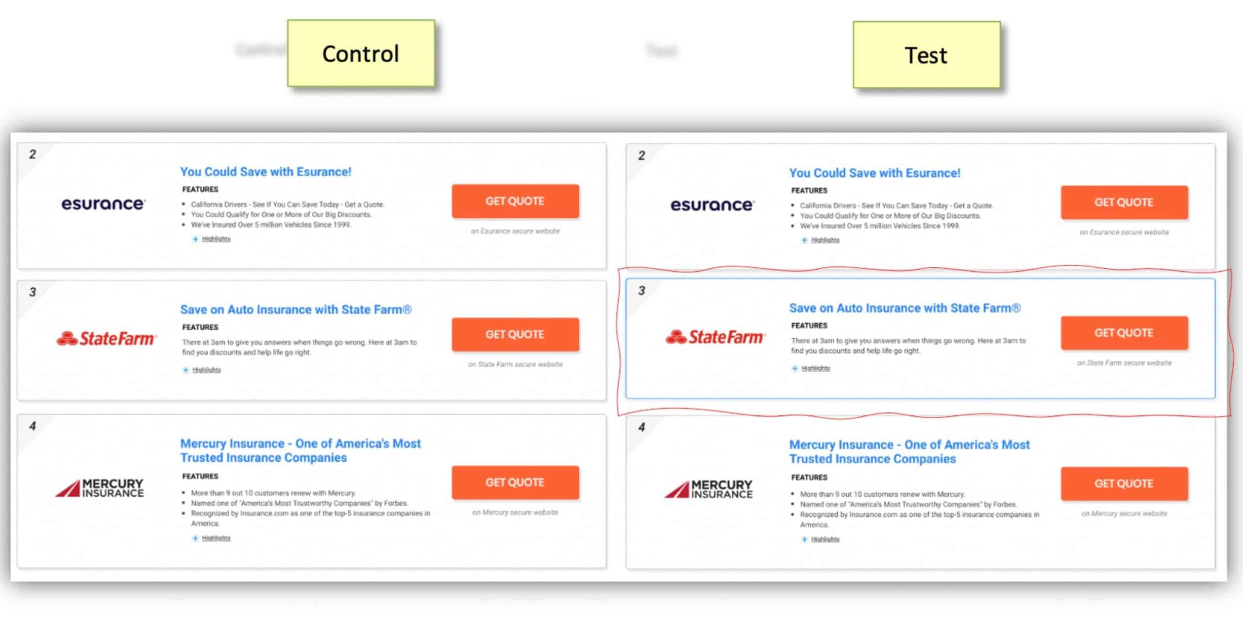
Landing Page: Featuring Call Outs
Test Hypothesis: by featuring different sub-products on the landing page, we believe users will better understand we can fulfill their specific needs because they are clearly outlined, leading to a lower bounce rate and thus a higher form completion![]()
Test Results: decreased bounce rate by 6% on Desktop and 2% on Mobile
- Landing Page: Featuring Call Outs
Test Hypothesis: by featuring different sub-products on the landing page, we believe users will better understand we can fulfill their specific needs because they are clearly outlined, leading to a lower bounce rate and thus a higher form completion
Test results: decreased bounce rate by 6% on Desktop and 2% on Mobile
2. Landing Page: Featuring Call Outs
Test Hypothesis: by featuring different sub-products on the landing page, we believe users will better understand we can fulfill their specific needs because they are clearly outlined, leading to a lower bounce rate and thus a higher form completion

Test results: decreased bounce rate by 6% on Desktop and 2% on Mobile
3. Listings Results: Hover-Over Animation
Test Hypothesis: by enticing users with a lively user interface, we believe it will better grab their attention, increasing engagement and leading to a higher click-through rate
Test results: increased click-through rate by 3%
4. Landing Page: Sticky Banner
Test Hypothesis: by sticking “an actionable banner” when the user scrolls past the main CTA button, we believe users will be encouraged to freely scroll through the page and browse, having an easy way to start the shopping process, leading to a lower bounce rate.
Test Results: decreased bounce rate by 5%
5. Listings Results: Featuring Position on the Results Page
Test Hypothesis: by featuring the 1st listings at the bottom of the page, we believe we’ll increase attention and click concentration to the top position because we are evidencing the recommended advertiser leading to a higher yield.

Test Results: increased number of clicks on top position by 4%.
6. Listings Results: Ribbons
Test Hypothesis: by adding a call out in a shape of a ribbon on the listings results, we believe users will better engage with the offer because a new visual element adds value, leading to a higher click-through rate.

Test Results: increased CTR by 5%-8%
7. Form Flow: Adding Tips to Guide Users Throughout the Questionnaire
Test Hypothesis: by adding a virtual advisor in each flow question, we believe users will better engage because it will be easier to understand how to answer more complex questions and their purpose, leading to a lower step drop-off rate.

Test Results: drop-off rate reduction varied depending on step/question, ranging from 0.3%-1.2%
8. Form Flow: Combining Binary Questions
Test Hypothesis: by combining binary questions in one step, we believe usability will improve because users can repeat the same action (choose and click one out of 2 options) in sequence, leading to a lower step drop-off rate.

Test Results: combined drop-off for grouped questions decreased by 50% leading to a 2.2% higher form completion
Conclusion
Building an optimization process is essential for any business with a digital presence. Some key steps must be followed to guarantee efficiency and efficacy, such as (1) identifying problems to be solved by setting your digital business goals, (2) using data and analytics to support, and (3) mapping touchpoints of friction with your audience. Once the key steps are completed, you should define your roadmap considering execution time and complexity, resourcing, and impact; these are all fundamental points to ensure the prioritization was done correctly. When it comes to execution, remember to do a thorough competitive analysis, bring your creative team in the idealization process, survey your consumers, build your hypotheses, define KPIs in function of the hypotheses, and document everything. Get inspiration from some of the tests mentioned in this article and get you’re a/b testing process in place.
Are you ready to get better results from all your digital marketing? Let the experts at CloudControlMedia help. Learn more today.
Guilherme Montanini, Director of Product Management, Monetization at QuinStreet